Hammam Tourism - Case Study · Brand Identity · 2023
Hammam is a Riyadh-based travel agency that provides quality, cost-effective business and leisure travel solutions. The task was to redesign the existing logo to reposition it as a leading agency in their field.
Industry | Duration | Region | Role |
The Challenge
The main problem was with their low-quality, outdated, generic logo. The company was trying to target a broader audience, and its existing identity didn’t embrace this. The goal was to design a creative, modern identity that would enhance their visual style.
Hammam Tourism had a loyal local clientele but a brand that looked like a 2009 clip art template. The founders wanted to compete with regional players for premium itineraries, but their existing identity made them invisible to that segment. They needed an identity that read 'considered, considered, considered' at first glance.
01 - Bilingual mark — must read with equal weight in Arabic and Latin script |
02 - Brand had to survive scale — from a 16px favicon to a Riyadh storefront |
03 - Differentiate from the 'palm tree + sunset' tourism cliché |
04 - Apply across print, digital, social, signage, and travel documents |
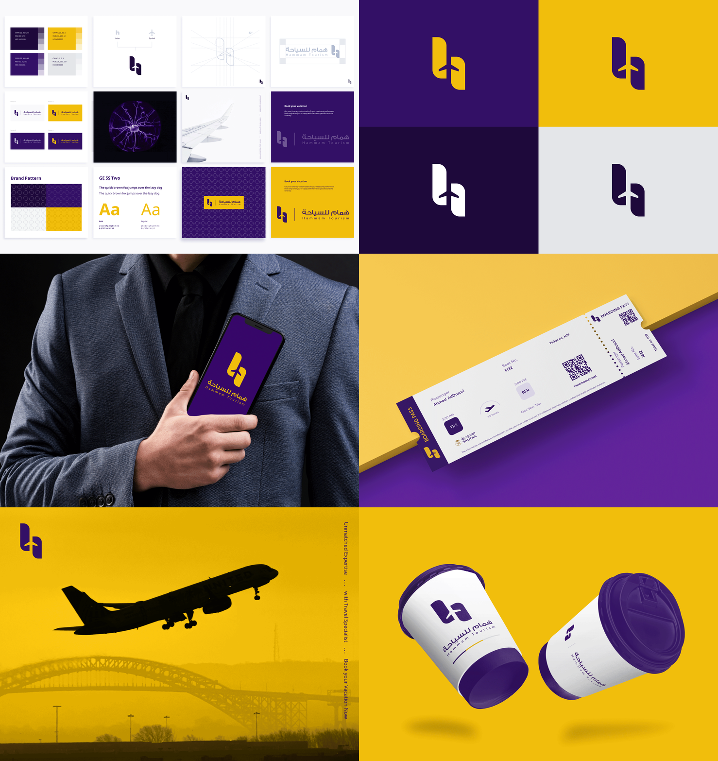
Logo Construction
During the exploration process, one concept stood out from the rest. We focused solely on that concept because we believed it was suitable for describing the business better.
Colors & Subtones
The proposed colour range was fresher than the previous brand colours. Purple and yellow are the primary colours. The purple colour stands for creativity and luxury. Yellow is about joy and positivity.
Final Touch
Our Approach
We worked the wordmark and the symbol in tandem — neither commits before the other does. The Arabic 'هـ' and the Latin 'h' were drawn from the same skeleton, giving the brand a single mark that reads in both scripts. Color stayed disciplined: one deep purple, one accent yellow, no decoration.
01
Position
Stakeholder workshops, segment positioning, and naming validation. Locked in 'premium considered' as the brand voice.
02
Mark
Wordmark and symbol developed in parallel — bilingual grid, dual-script construction, accessibility tested at 16px.
03
System
Color, type, brand pattern, photography direction, and voice guidelines. Full bilingual identity package.
04
Roll Out
Stationery, social templates, web identity, signage spec, itinerary documents — all bilingual, all on-system.
What we shipped, what it did
Outcomes
2 Scripts
Latin + Arabic with identical visual weight
4 Versions
Identity locks for every brand surface
2.3x
Premium itinerary inquiries in 90 days post-launch
<8wk
From kickoff to a full bilingual identity system
Customers testimonials
The new identity didn't just change how people saw us — it changed which customers walked in. Within three months of launching, the kind of brief we received looked completely different. Zaawia understood the business move, not just the design.
Insights
Check out what's new in our latest content!
Next Case Study
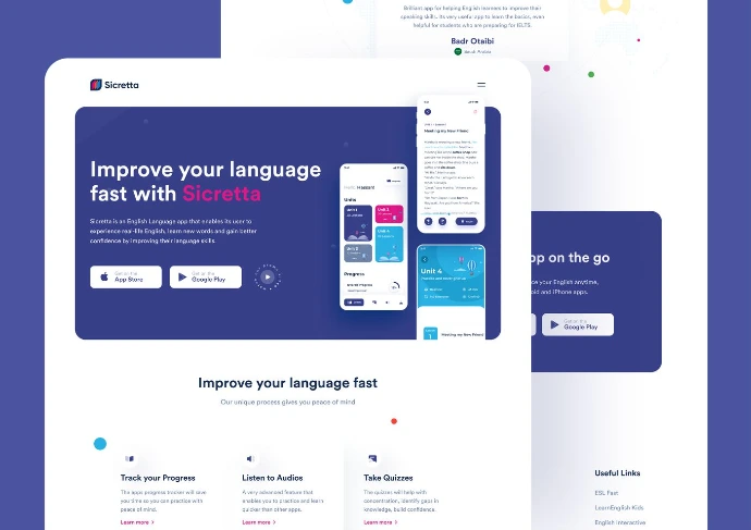
Sicretta →
Mobile App · English Learning
An English-learning app that transforms silent learners into confident speakers through immersive, gamified, real-life conversation.